If It Ain’t Broke Don’t Fix it
by Ryan Garnett on June 12th, 2015If you were to pull out a direct mail pack from any time prior to 2010 what are some things that you notice?
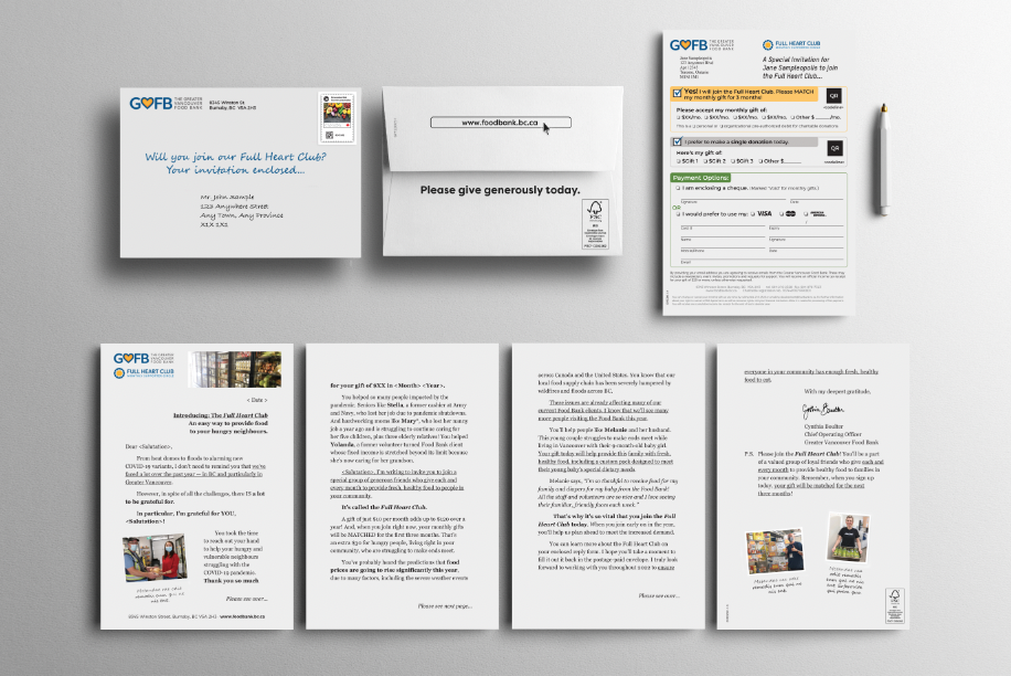
The pack likely is very basic in its design, possibly including a short teaser, “Your gift enclosed”, “Renew your support today” or an emotional quote. But what you probably wouldn’t see from back then is glossy paper, full bleed, full colour designs and the reality is that these very simple designs worked.
With online integration becoming more and more a part of every organization’s annual giving program has come a need to make things ‘pretty’ and rightfully so. Online, your presence needs to be attractive and easy to navigate. It needs images; pictures and design to stand out although what escapes us is in direct mail is this is not necessarily what’s going to set you apart.
As a foundation it is important to remember that your most loyal long-term donors are those that may not have grown up with colour TV. Flashy is not what they connect to. The reason they are loyal donors is because they love your foundation. They want to feel that emotion when they receive a direct mail piece from your foundation because that is their reassurance. That is what comforts your donors when making the decision to continue giving to your foundation.
Direct mail isn’t going anywhere anytime soon regardless of how progressive we become online. And many on the people on your donor file at this time are likely most comfortable with mail. This leads me to a few gentle reminders when developing your next direct mail piece:
- If you are using images on your direct mail outer envelopes ensure that their purpose is to create an emotional response, not just because they are ‘pretty’.
- Be clear with your teaser copy and always remember to be donor focused.
- Ensure that your outer envelope creative compliments the other package elements.
- Don’t feel like you have to have a teaser or design elements on your pack.
- Don’t be afraid to test. The only way to really find out what works for your foundation is to run creative A/B tests. Small changes can make the world of difference for your results.
Aristotle says “What we have to learn to do, we learn by doing” and this is great philosophy to have when diving into your next direct mail appeal.
Renewal
This is the template you clicked for.

April Campaign
This is the template you clicked for.
Spring Campaign
This is the template you clicked for.
Holiday Campaign
This is the template you clicked for.
Template Name
This is the template you clicked for.
Template Name
This is the template you clicked for.
Template Name
This is the template you clicked for.
Template Name
This is the template you clicked for.
Template Name
This is the template you clicked for.
Template Name
This is the template you clicked for.
Template Name
This is the template you clicked for.
Template Name
This is the template you clicked for.
Template Name
This is the template you clicked for.
Template Name
This is the template you clicked for.
Template Name
This is the template you clicked for.
Template Name
This is the template you clicked for.
Template Name
This is the template you clicked for.
Template Name
This is the template you clicked for.
Template Name
This is the template you clicked for.
Template Name
This is the template you clicked for.
Template Name
This is the template you clicked for.
Template Name
This is the template you clicked for.
Template Name
This is the template you clicked for.
Template Name
This is the template you clicked for.